
I was reading Your essential ‘how-to’ guide to writing good abstracts
… and then I wondered, would a simple (clumsy) graphic pie chart help make the breakdown of components more memorable? I just used Excel so a proper graphic program would make something a little cuter, but yes I think the principle may have some relevance, then again, is it just because I had to think and retype and categorize the abstract components?
Well, basically every component (Literature research, describing methods etc) is 1/6th of the total, just weigh methods and sources by a factor of 2, as I have or 3, a 1/2, if possible). Simples. Don’t really need a chart for that.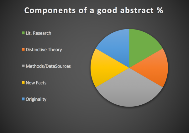
| Information component | Components of a Good Abstract % | Number of words (for a 300 word abstract) |
| Lit.research | 1/6 | No more than 50-60 words |
| Distinctive Theory | 1/6 | At least 50 words |
| Methods/Data Sources | 1/3 | From 50 words minimum to 150 maximum |
| New Facts | 1/6 | As many words as possible within your limit |
| Originality | 1/6 | At least 30 to 50 words |
| Total | 100% |
