
The Dean of Research at my Faculty of Humanities asked this yesterday.I have decided this could become a future book project, answering that question, I mean.
Some beginning links are here:
http://www.quora.com/What-are-some-critical-data-visualization-works
Data visualisation but good http://www.mulinblog.com/2013/09/03/data-visualization-matters/?utm_source=buffer&utm_campaign=Buffer&utm_content=buffer612ef&utm_medium=twitter
http://www.asis.org/Bulletin/Apr-12/AprMay12_Bailey_Owens.html
http://viewshare.org/views/jefferson/fulton-street-trade-cards-collection/
Good slides roundup http://www.slideshare.net/smithss_27106/data-visualization-and-digital-humanities-research-a-survey-of-available-data-sets-and-tools
A conference this question may have been answered: http://hyperstudio.mit.edu/h-digital/
http://www.quora.com/Data-Visualization/Why-does-visualization-matter
To explain this to my students I usually refer to the best historical examples. Epidemiology, for instance, would not be the same without thematic mapping, as maps let you take a peek behind the data, see what the numbers hide. The classic is Snow’s Cholera map, obviously, which I praise here http://blog.visual.ly/infographi… but there are many others. I’d recommend two books about data maps: “Cartographies of Disease” http://www.amazon.com/Cartograph… and “Early Thematic Mapping in the History of Cartography”http://www.amazon.com/Early-Them… which revisits some well known names, such as Charles Joseph Minard, and casts lights on others that are not so well known.
http://blogs.hbr.org/hbr/hbreditors/2013/03/power_of_visualizations_aha_moment.html
here’s an “Aha!” moment sometimes. Even on the most obvious things. Take Matthew Bloch [and Shan Carter and Alan McLean]’s census maps.
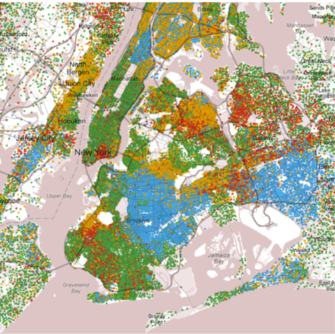
Click to see larger image. View the interactive version here.
source: New York Times
I’m just seeing what I basically know: New York neighborhoods are segregated. But I felt it in a way I never had before. You can feel a good data visualization.
One thing we did was take a very simple unemployment chart — your most basic visualization — and we let people choose a Democrat or Republican interpretation of the data.
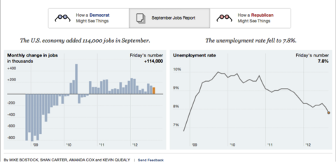
Click or touch to see larger image. View the interactive version here.
source: New York Times
You can literally see the visualization change based on whose point of view was highlighted. It would be silly to interpret any data viz as truth. They are interpretations of truth.
